Switch to Reuse

Chart-Reuse by Upstream is the industry’s first foodware reuse analytics platform. A free-to-use data tool that helps organizations planning and implementing reuse systems project environmental and financial impact, track operational performance, and generate trusted reporting for stakeholders.
Whether planning a reuse transition, managing an active program, or shaping policy, you need reliable data to justify investment and measure success.
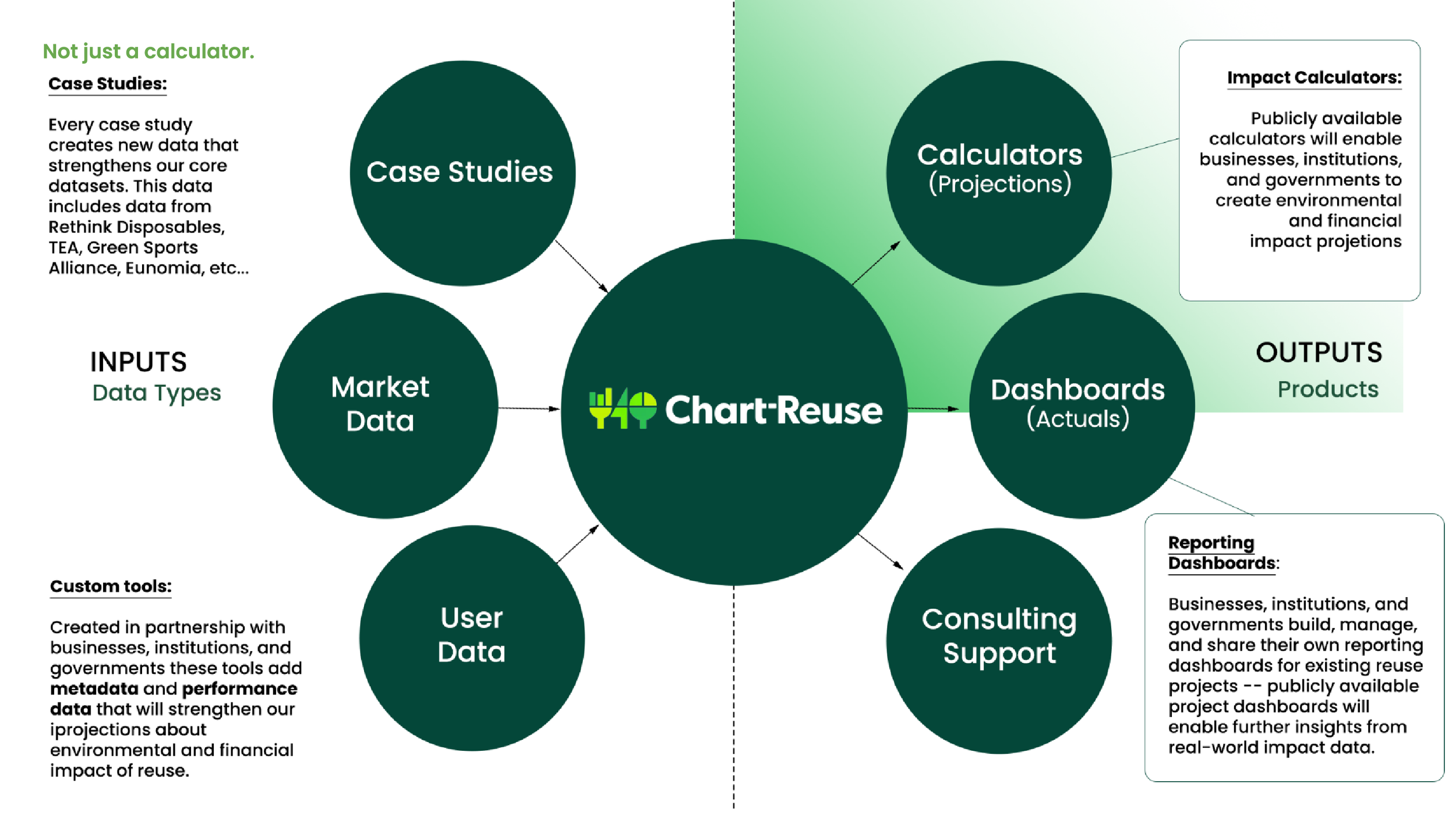
Chart-Reuse provides institutions and companies the ability to create impact projections using customized templates and evidence-based data models, and to evaluate the impact of ongoing systems or pilots. These impacts are expressed through five primary metrics: GHG savings, water savings, waste reduction, single-use unit reduction, and cost savings.
Make the case for reuse with real data.
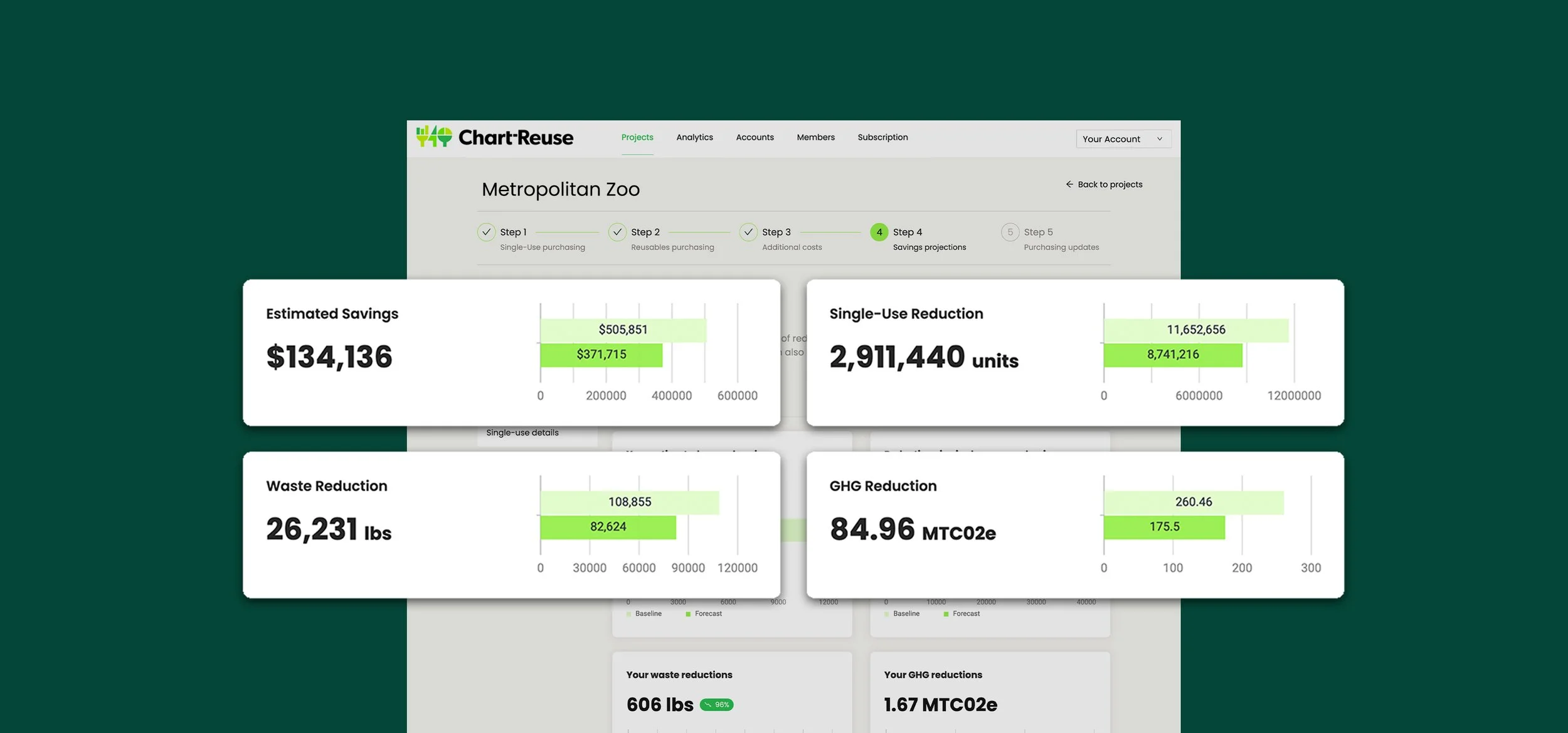
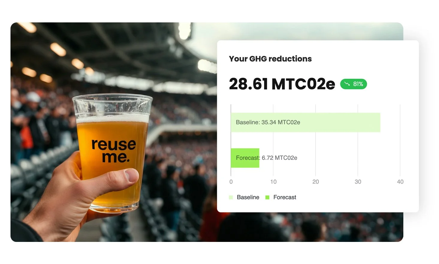
In the early days of the reuse movement, organizations were eager to launch reuse programs but lacked the tools to quantify their environmental and financial impact. Upstream built Chart-Reuse to solve that problem — giving advocates, institutions, and businesses a way to model what switching to reuse could look like before making major operational or financial commitments.
Chart-Reuse first launched as a projections platform that helped users estimate the economic and environmental outcomes of replacing disposable packaging with reusable systems. Organizations could model variables such as packaging volumes, costs, greenhouse gas emissions, and waste reduction to better understand whether reuse made sense for their specific use case. These tools helped schools, venues, businesses, advocates, and policymakers make stronger cases for investment by replacing assumptions with credible data. As reuse systems matured, so did the need for better operational intelligence.
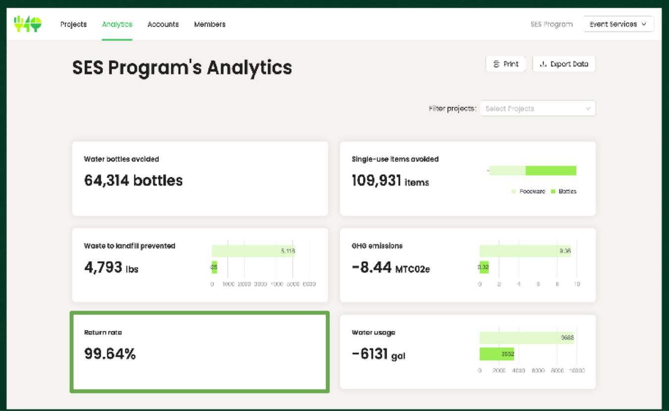
Today, Chart-Reuse also provides reporting tools for active reuse programs that need to track real-world performance over time. Municipalities, reuse service providers, institutions, and operators can use the platform to monitor return rates, product loss, operational costs, and environmental impact while generating reports for funders, partners, leadership teams, and policymakers. Instead of simply predicting impact, organizations can now measure what is actually happening in the field and continuously improve their systems.
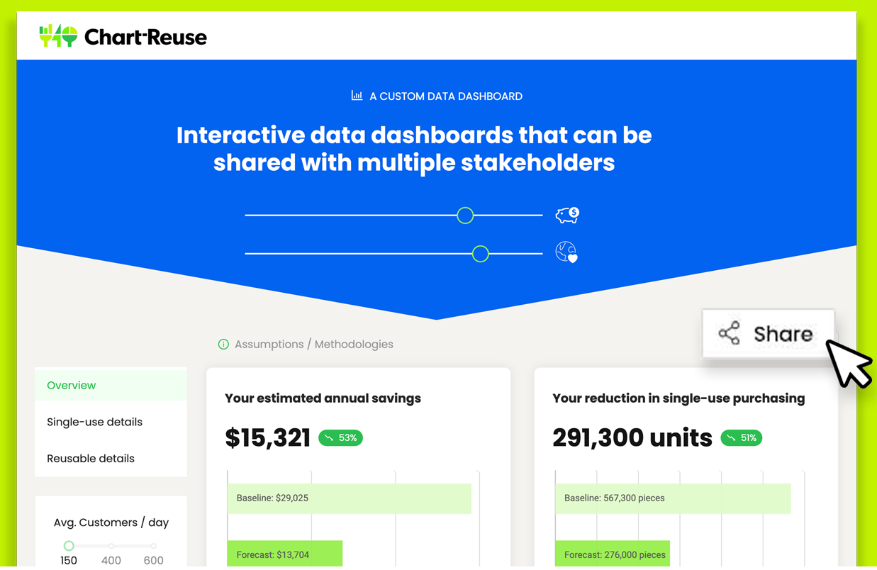
Chart-Reuse is intentionally built as neutral infrastructure for the broader reuse ecosystem. Using methodologies reviewed by Oak Ridge National Labs, it is not tied to any single product manufacturer, logistics company, or service provider. By standardizing how reuse performance is measured across sectors, geographies, and business models, the platform creates trusted, comparable data that can be used by operators, funders, policymakers, and industry leaders alike. Every new project strengthens a growing evidence base that helps the entire movement better understand what works, where challenges exist, and how reuse systems can scale more effectively.
Looking ahead, Upstream’s vision is for Chart-Reuse to become the shared intelligence layer for the reuse economy. As more organizations contribute real-world operational data through platform reporting and future API integrations, Chart-Reuse will evolve into the most trusted repository of reuse performance data in North America. That means helping cities design smarter policies, helping funders make better investments, helping operators improve performance, and ultimately transforming fragmented pilot programs into a coordinated, data-driven movement capable of scaling reuse at a systems level.
Success Stories
-
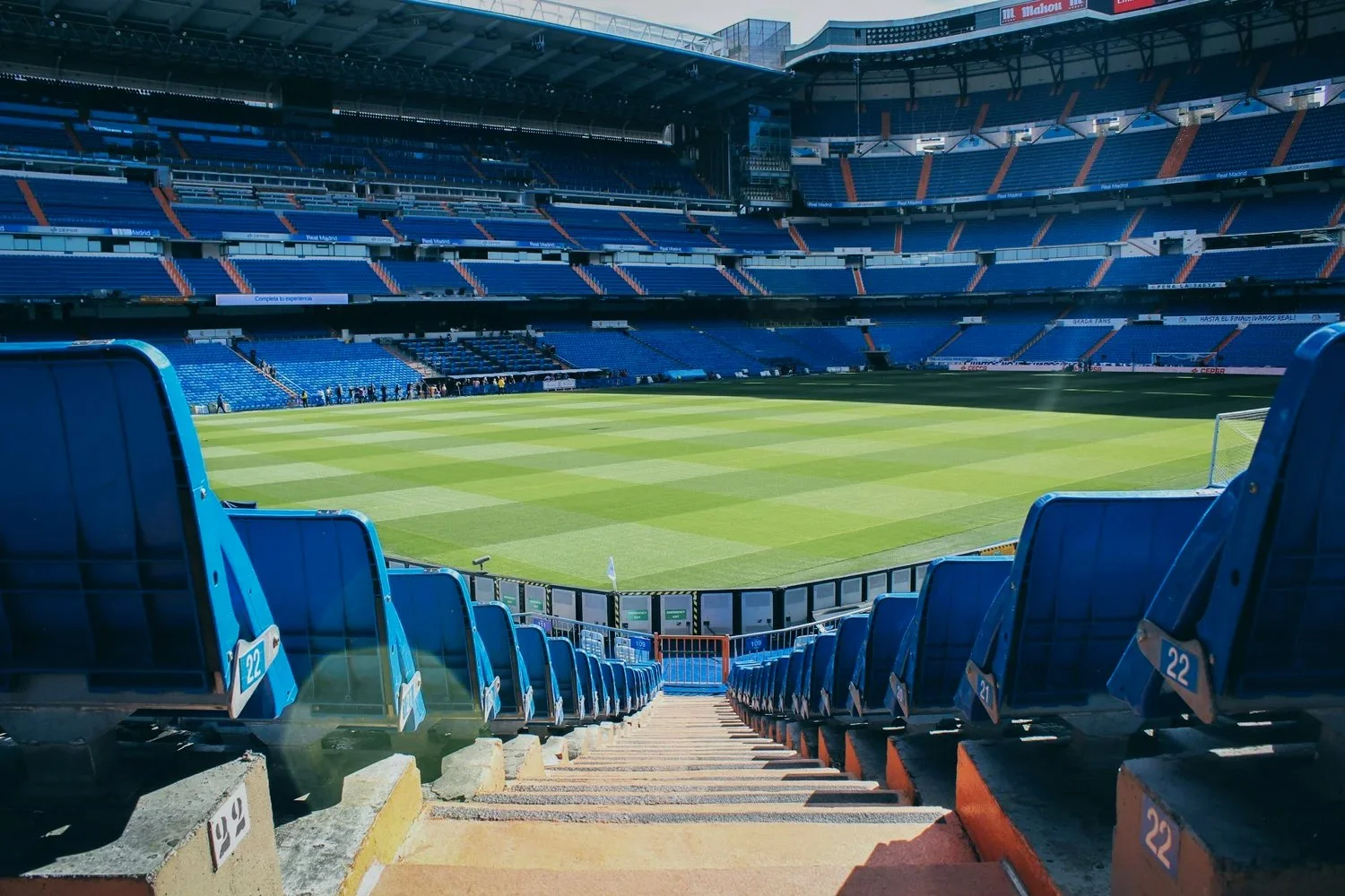
![Empty football stadium with green field and blue seats, view from top of the stairs.]()
Stadium
ALUMINUM vs. REUSABLE
A reuse service provider wanted to show stadiums the difference in carbon emissions between polypropylene reusable cups and aluminum cans. -
![Back of a yellow school bus]()
High School
SWITCH to REUSE
With Chart-Reuse, we were able to show the impact of switching to a reusable bowl in a high school cafeteria. -
![Coffee bar area with glass jars containing metal straws, wooden stir sticks, and green-striped straws, along with bottles of flavored syrup.]()
City Government
SKIP THE STUFF Legislation
When city legislators required local data to consider Skip the Stuff legislation, a small community organization turned to Upstream for help. -
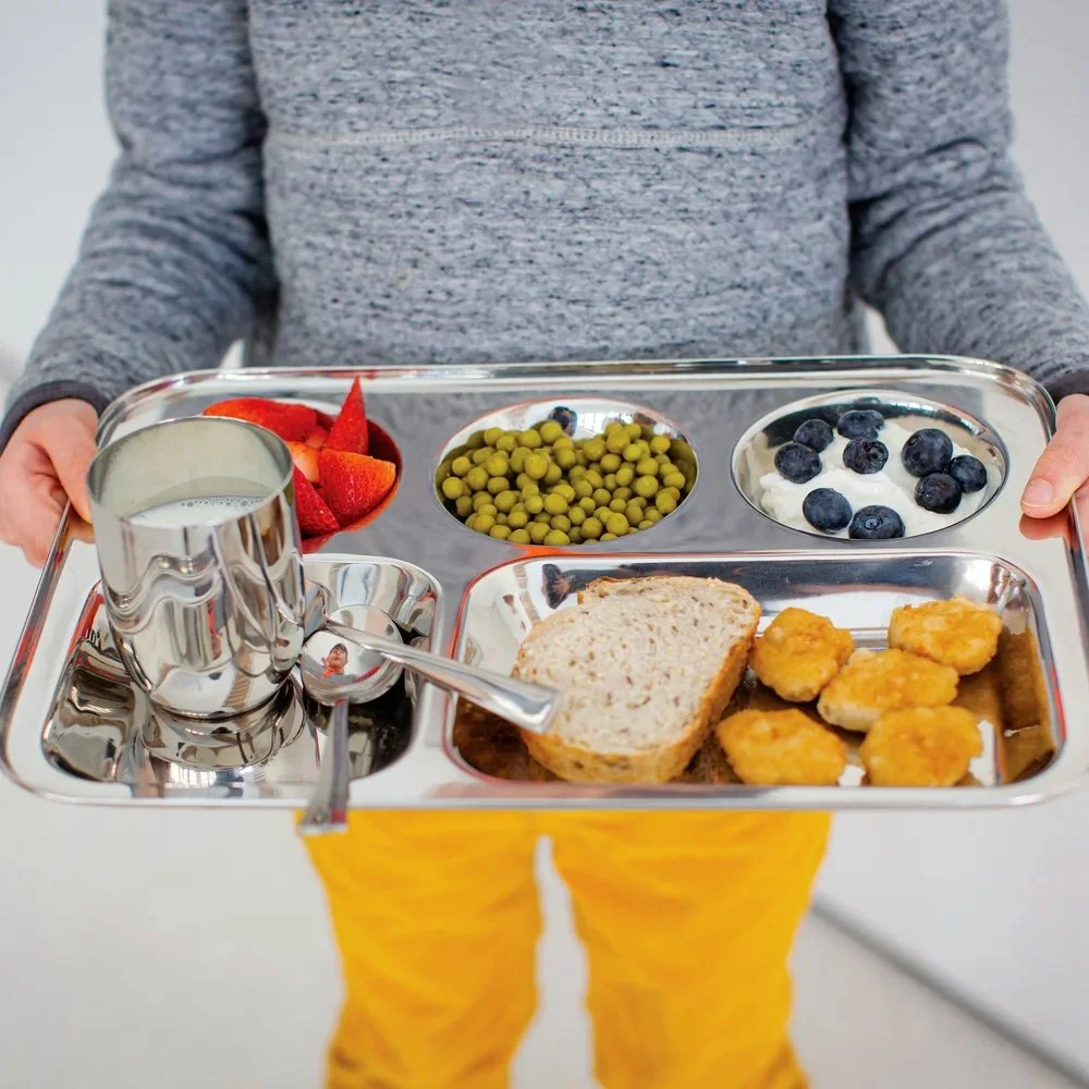
![A child holding a metal tray with various foods, including strawberries, green peas, blueberries with cream, a slice of bread, and fried food pieces, along with a metal cup of milk.]()
Middle School
NATIONAL PILOT
The Conscious Cafeteria Report on reusable foodware for healthier, more sustainable schools—with projections calculated in part using Chart-Reuse. -
![A modern multi-story building with glass facades, surrounded by green lawns, trees, and walkways. People are walking and biking on the paths, and some are gathered on the terraces and open areas.]()
Zero Waste Consultants
TRUE Certification
A circular economy consulting firm wanted to monitor the environmental impacts of their clients and help them reduce waste through reuse. -
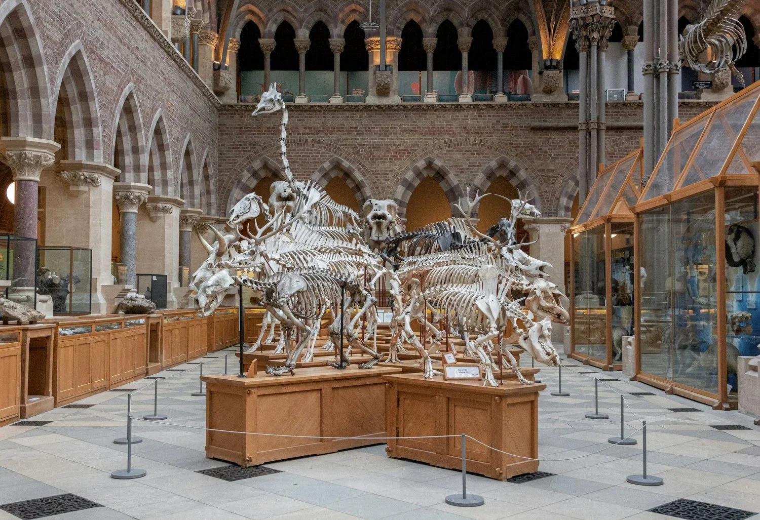
![Exhibition of animal skeletons, including a large mammal skull, within a museum hall with brick arches and glass display cases.]()
Cultural Attraction
Feasibility Study
Chart-Reuse helped a metropolitan cultural attraction figure out how much they would save by switching to reusable foodware for their concessions. The results are in: reusable foodware saves money, emissions, and water.